A Clockwork Orange – Penguin book cover competition
Posted: April 29, 2016 Filed under: Subject | Tags: A Clockwork Orange, Baby, Book Cover, Design, Graphic, Graphic Communication, Penguin, Toby Cottrell Leave a commentThe Penguin Adult-Fiction book cover awards is the first time that I have ever entered a design into a competition, and is also the first time that I have attempted to design a book cover. When I found out that we would be taking part in the competition and that the cover we would be designing was going to be A Clockwork Orange, I knew that it was going to be a bit of a challenge. I had heard of Anthony Burgess’ A Clockwork Orange before, although the references that I was familiar with usually came from the film and not the book (as most do). Never the less, I was looking forward to having a go at designing something interesting and different.
After watching the film and reading the book, I looked back on what I had just experienced and tried to think of the most prominent themes. There are some very obvious ones like police brutality and government control, but the one that I picked up on the most was the psychology of violence. It is such a controversial and in-depth theme, so I knew that there would be a lot of potential for an interesting book cover.
After knowing the theme that I wanted to focus on, I started to do some research on some of the more popular book covers. There have been many covers over the years that have caught my eye and many of them that really made me think. One of the clear goals of a book cover is that it should reflect the themes and atmosphere of the book, while also getting peoples attention. A book cover that I am very fond is Dan Brown’s The DaVinci Code. It’s such a simple concept, the peeling away of paper to show something underneath, but the positioning of the eyes adds such mystery and tenacity to a very striking but beautiful painting.

When it came to actually designing the cover, I decided that I wanted to do some different. A Clockwork Orange is a very controversial book and in a lot of ways it doesn’t take itself too seriously, and that’s what I wanted my cover to be about. The main inspiration of the cover actually came from an album cover, which is many ways is incredibly similar to book covers. The album cover for The Notorious B.I.G’s Ready To Die is an artwork that I have always remembered. The baby on the front cover, by himself, always seemed to grab my attention. It was probably down to the simplicity of it, and the positioning of the baby allowed for a lot of space for text to be placed. Also the contrast between the child, and the theme of the text and album title plays a big part in why the album cover is so iconic.

My initial design tries to portray the juxtaposition between the innocence of youth and the violence in the book. Everyone starts of as a blank slate, an innocent child with no idea of how the world works. Having the baby sitting in the middle of the page with the hat and the glass of milk that the main character Alex is famous for having is supposed to remind the reader that this hyper-violent animal used to be an innocent child, just like the rest of us.
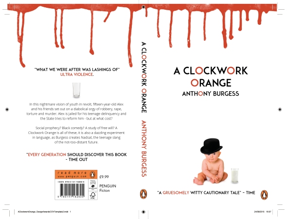
The fonts that I chose are Adam and Roboto. Adam is a very clear but harsh title font, with a lot of sharp edges and bold letter forms. I felt that the way that the O is shaped was perfect for the title and allowed me to create a subtle visually effect that referenced the orange. Roboto is the font that Android use for their main font, just like Apple use Helvetica, and it is a very simple but diverse font that fits well with almost anything. Therefore it is perfect for the body text.
I received a lot of good feedback from peers and tutors, and a lot of people thought that having the blood drip down onto the page was another good way of showing the theme that I was attempting to portray. Although the main criticism that I received was that it wasn’t dark enough.
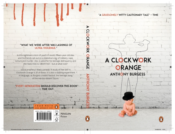
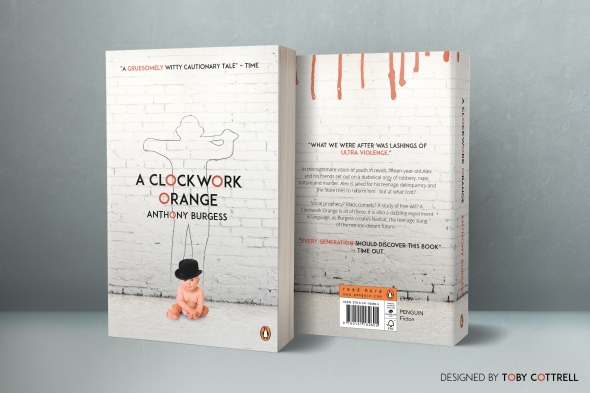
For my final draft I added a brick wall as a backdrop for the entire cover. I thought that it was a good way to keep the minimalistic feel of the cover alive, while also making it a bit darker and grungier. The graffiti outline of one of the gang members is what really made the cover come together in the end. It puts a lot of context into the themes that I am trying to portray, I think that it makes for quite a controversial and powerful cover. I also decided to move the blood drips to the back page as the front page was too crowded and taking them away made the focus on the baby and the outline a lot more prominent.
I thoroughly enjoyed designing the book cover. It is definitely one of the most evolved pieces of work that I have done and it took a lot of trial and error to make it the best that it can be. I will definitely be having a go at designing more book covers in the future.
Three Small Handbooks On Big Bears | Term 2
Posted: February 12, 2016 Filed under: Field | Tags: Bears, Design, Graphic, Graphic Communication, Toby Cottrell Leave a comment
The three week field project is over, and I have my final outcome, finally! Although I had a lot of fun designing these three books, I don’t think I have ever been so stressed and nervous about a project in my life. That may sound a bit over the top, and maybe it is, but I tried so hard to make these books the best that they could be.
When starting the project, titled ‘Significant Information’, I was struggling to find an interesting topic that hadn’t been done before. I had loads of ideas, for example I was thinking of doing something about violence in video games and films, or maybe an animation all about how famous musicians and athletes get where they are today with practice. I then came up with an idea of making an infographic all about infographics, which would show statistics about them and what the most popular designs are. Although unfortunately due to the popularity of infographics, the idea had already been done before.
So I went back to the drawing board, but not for long. I couldn’t decided on what I wanted to do so I just said “screw it” let’s do it on bears, bears are cool. I was also wearing a bear jumper at the time so that probably contributed to the decision. Another part of the reason was that I wanted to take advantage of the freedom of this project, and the fact that I could do it on something as cool as bears was awesome. It also meant that I could experiment with the imagery and form of the bear, as well as the statistics.
So as a quick bit if primary research I went to my local Tesco’s and started asking people questions about bears. Surprisingly only 3 out of 30 people could answer where Black Bears come from, the answer being North America (they are literally called the American Black Bear). This made me determined to inform people about bears, and I made a pledge to myself and the animal kingdom to make this task a great success.
My very initial idea was to create a poster on bears but after my first tutorial with David, he suggested making handbooks, which I thought was a great idea. A handbook for each bear, with the bears being polar bears, black bears and brown bears. I envisioned the handbooks being short and sweet, so an A5 size paper seemed to suite them quite well.
So to start of the design process I drew and vectorized three bears, which would then set the style and colour pallet for the handbooks.


Once the bears were sorted out it was now all about the content. I wanted to split the book up into 5 sections. All being double page spreads, so it would be 10 pages of content in each book. The sections covered the basics of the bears, which included their size, what they eat and where they live. David also suggested a page of typography would work well to split the book up.
The first couple of designs went well. I created a good front cover, and started to develop and explore the theme. My first main tutorial with David was incredibly useful, and he really helped in the development of the books. He thought that the books needed to be more open, with the text being smaller and the icons bigger. And after doing so I realised how much more it opened the book. Below is an example of how the pages changed.

First draft of the size page

Final version
As you can clearly see, making he icons bigger and the text smaller really brought the pages to life. Having a plain colour background was another suggesting that David made, and again it really improved the final product. It made the contrast between text and illustration a lot clearer, while also simplifying everything.
One of the initial ideas of the books was to design the bear’s environment, but after some testing I realised that this would be too much work and would limit how many pages I could create. I still wanted to feature their environment in the book somehow, so I found some amazing pictures from photography blogs on the internet (not copyrighted) and added them subtlety into the design. Each bear has its own environment, and each page will feature it in some way.
This project has been so much fun, and I have really enjoyed making the three books, even though it was a lot of work! I have learnt so much about design and page layout, plus how to handle information and make it understandable and clear while also being beautiful. I am looking forward to improving these books until they are perfect, and then getting them printed off at a professional printing studio. Below are the mock-ups of the three Small Handbooks for Big Bears, editions 1, 2 and 3.


Information Is Beautiful | First Project | Term 2
Posted: February 12, 2016 Filed under: Field | Tags: Design, Graphic, Graphic Communication, Information, Toby Cottrell Leave a commentThis terms field project was excellent. From the workshops, to the speakers we had in, the entire project was an invaluable experience. David had everything organised well, and we always has something to do. At the start of the year I was regretting choosing two very similar Field options that were close to my subject, as I thought it might of been better to try new things out, but in the end both of the projects have really helped me improve as a designer.
The first small task that David set us was to create an outcome based on information we had collected from the day we were set the task. And as it’s field, we were put into groups of three. My team members were Cara and Reece, with Cara doing Graphics and Reece being a Product Designer I thought that we had a good mix of ideas. With the team dynamic working well and after thinking of an idea, we got straight to work.
The information that we recorded was quite straightforward, it included counting the amount of people smiling, socialising and using their phones in three specific locations around the campus. What really made the outcome interesting was what we decided to do with that information. So after some debate we decided to make three posters displaying the information, but instead of showing the information using graphics, we wanted to use actual people around the campus. So we booked out the photography studio, and brought in as many people as we could find to take pictures of.
With Reece managing the pictures, and Cara creating illustrations, and me designing the layout. We came up with these three posters.


We thought that putting everyone on a shelf was a good way of categorising the individuals, while also making it more humorous and light hearted.
In my opinion the posters were a great success. They display the information clearly and make people think about what they do when they walking around the University. Obviously there are always improvements that could be made, especially when it comes to printing as the posters came out a lot darker than expected. All in all the first project went well and working with Cara and Reece was a lot of fun.
The Hidden History of Cardiff | Subject/Field group project | 3rd – 23rd February
Posted: March 17, 2015 Filed under: Field, Subject | Tags: Cardiff, Design, Graphic, Graphic Communication, Hidden City, Hidden History, Project, Toby Cottrell Leave a comment
Credit to Mitchell Scott for the front cover
On the 5th of February we started to work on the first project of the term, making the ordinary extraordinary, specifically focusing on the theme ‘hidden city’. My group, which includes me, Mitchell, Geraint, Amy and Rhys, started to brainstorm ideas and figure out what direction we were heading in. The initial ideas were set around creating a collaborative compilation of all our work, with the main focus being the hidden history of Cardiff. We all gave ourselves a location in Cardiff that we could create the work around as we felt that the group all had different graphical and artistic styles. We wanted to then put all of our work into a book which would have included all of our work, along side facts and statistics about Cardiff and comparing the old and new.
As we started to get on with the work, which was going well, we had a mid-project tutorial with Ray. We presented him the idea along with some of the work we had already produced, but he felt that the project would benefit more from creating one piece of work which showcased all of our skills instead of it just being a compilation of our work. He particularly liked one of Amy’s original ideas, which was to create a map of Cardiff which would include information about each area in an info-graphic style. Here are her original sketches.

After some discussion we decided that this was definitely the best route to go down and we all felt like it was manageable in the two weeks we had left. The main idea was to create a book, in the shape of the map, with each area being highlighted and having its own page that would show statistics and information about it. We decided that each area would be singled out by removing the other areas, and then using that blank space to put all of the information in. The original map was changed slightly as a lot of the locations were quite small meaning that we couldn’t put in a lot of information, not enough for an entire page anyway. To fix this we combined a lot of the map, so that we could feature information about multiple areas in one space. To kick off the creative process Mitch created a vector map of Amy’s sketch, and also assigned us the areas that we could each do.

Once we had our locations we were able to get to work, which was pretty exciting for me as I love to create info-graphics. The main area that I had to cover was on the West side of Cardiff, luckily there was a good amount of content to include as St Fagans is a very historical place. The only problem with everyone creating their own info-graphics was that we all had different styles, which could make the book look messy and unprofessional. In the end a lot of our graphics came out the same, as I came up with a good style that we could all follow. Which can be seen below.


I tried to go for a very simple style that would clearly show the main facts of each area, while including images and icons. The group seemed to like it so they also created their info-graphics in this style. Although some of the areas had too much information to fit in the small spaces therefore Rhys and Mitch created graphics which were more text based, which also meant them changing the font from Helvetica to Georgia.


Once we had all completed our info-graphics and were happy with them we went to the print studio on campus to get them printed out professionally. We had them printed out on A4 and then cut around the black borders so that they were all relatively in the same shape although it was quite messy, ideally we would have liked to get them laser cut but we didn’t have the time. We bound the book together using some of my string so that we had a prototype to show everyone during our presentation.
In conclusion I feel like the group project was very successful and we achieved what we wanted. Even though we changed ideas mid project, we still came out with a good piece of work that we call contributed to equally. We always communicated and shared our ideas. There was always a fairly positive atmosphere as I feel as if we all wanted to do good work that would impress people. There were a few strong personalities in the group, which was good as everyone would always share their opinions on things and didn’t mind it if people disagreed with them. I think that personally I did well as a group member, I always communicated with the group and made sure that I never accidentally took the wheel and went with my own ideas without consulting the group first. All of these factors definitely played a huge part in creating our final piece, which I am very proud of, and I know the rest of my group are as well.
Making the ordinary extraordinary | Group Project | 2 – 3rd February
Posted: February 4, 2015 Filed under: Field, Subject | Tags: Design, Graphic, Graphic Communication, Making the ordinary extraordinary, Project, Term 2, Toby Cottrell Leave a commentWe have finally been given a project following the theme ‘Making the ordinary extraordinary’, which will be a group project taking place over the next 3 weeks. There are three sub-themes; hidden city, power & technology and migration. We have to choose one of these themes to base our work on, I went for hidden city as I thought it had the most potential for creative ideas.
Everyone was split into large groups depending on what theme we wanted to do. In those groups we talked about what angle each of us hoped to approach the project from. My idea was to look at Cardiff’s infrastructure, potentially the layout of the power grids and sewage lines, and then see if it was possible to see the similarities they had to an actual map of the city. To find the other members of the group we chose people who had similar ideas to ourselves, which surprisingly wasn’t too hard to do. There are five of us in the group, it includes myself, Rhys Buge, Mitchell Scott, Amy Dunstall and Geraint Jones.
We got together as a group Monday afternoon and most of Tuesday to brainstorm and come up with ideas, as the goal for the end of Tuesday was to come up with a proposal explaining the message we are trying to put across with our work. After putting all of our ideas together we came up with what we think is a good angle on the project. The basic concept is that we want to look back and compare the history of Cardiff to the present day. This is going to include as much information as possible, including crime stats, architecture, people, fashion, population, infrastructure, maps and even how society has changed over the years. This means that we will have to gather a lot of research, and we know that this optimism could potentially be quelled by lack of information on some of the topics. We have only just started thinking of what we could make but we know that it is going to be a series of pieces of work, not just one outcome. I am looking forward to this project, and i’m sure the rest of my group are as well.
5 Minute Walk | 19th January
Posted: January 24, 2015 Filed under: Subject | Tags: Design, Graphic, Graphic Communication, Map, Toby Cottrell, Walk Leave a commentAlong with the 15 Tasks project, we were also given a small task at the start of the week to be done that day (but be presented on Friday). The task was to get into 2’s and go for a 5 minute walk and then map out the area, but obviously it had to be in a creative way. Elliot and I decided to pair up and start out walk at the park, as we thought it had some good potential for mapping out an area creatively.
We came up with a good idea of writing down what we saw, thought and felt as we walked along the path. We “mutually” decided that Elliot would write the words down, while I suggested them. It went rather well and although we ended up going a little but over time, we produced some pretty interesting results.
To turn the words into a nice composition we put them on Photoshop and tried to figure out how to make this block of text look nicer. My idea was the try and put a vector line of the path we walked down the middle of the paragraph, which turned out to be a bit simple. We then thought of using the words to make the path, evolving into mapping out the entire walk using text. We then threw in some nice effects like changing the colour of the words depending on the object. We also added a gradient to the words on the path making it transition from blue to orange, as the temperature gradually started to get warmer as the walk went on.
It was a nice task to start of the term as it helped to kick my creativity back in to action, although there wasn’t much there in the first place. Practically the task wasn’t too difficult, but it did have a lot of potential for good and creative ideas. I think our mapped out walk turned out to be quite good, but maybe I could have tried to map out the entire area with text as there was a lot of blank space on the page that could have been used up.

15 Tasks project | Monday 19th – 23rd January, 2015
Posted: January 24, 2015 Filed under: Subject | Tags: 15 Tasks, Design, Graphic, Graphic Communication, Haye's Island Cafe, Project, Term 2, Toby Cottrell Leave a commentThe first day of the new term started with two projects, one big and one small. The big project involved getting into groups of 4 and completing 15 very different tasks, all of which have to be done in a certain area in Cardiff. The area that we were given was a small café located in the city centre called Haye’s Island Snack Bar.
It was a very interesting place architecturally, as it was literally a small island in the middle of the street that was full of tables and small stalls. It had a lot of interesting features, for example there were three chess tables that are set in the concrete so that people can bring their own pieces and play. Also there were these strange lights on the floor that covered most of the area, unfortunataly we didn’t stay long enough for them to turn on (if they turned on at all). I will write about some of the ones tasks that I completed and also the ones that I found intriguing

Looking at the tasks I realised that a lot of them would involve sketching and drawing parts of the location, which isn’t one of my strong points. Therefore I decided to volunteer to complete the ones that involved writing, so that I could then turn then into graphic composition later. I documented the time, wrote down a conversation that was overheard and wrote a short story/narrative about one of the objects found in that area.
The first one I volunteered to do required me to write a short story/narrative about an object that could be found in the area. I felt as if this might be a more suited task for me as I enjoy writing and thinking of stories. When trying to find an object to write about Elliot saw that one of the giant umbrellas, which were placed in wooden holders around the area, was closed while the others were all opened. This made it look lonely and sad, making me think that it was an interesting object to create a narrative for.
Instead of writing a short story like many of the other groups did (not saying there is anything wrong with that), I thought it would be best to write something a little more mysterious about this droopy umbrella. Therefore I decided to write a poem about its past, which only took me about 5 minutes. It actually turned out to be fairly good and quite sad, which was what I was going for. Below is the poem that I have turned into a graphically designed piece making it easier and nicer to read.

One of the tasks that I found very interesting was the one requiring us to map out the sounds in the area for 15 minutes. Jake came up with a great idea of using sound waves that are continuously going in a circle to recreate the volume of the sounds around him. It’s this brilliant idea that seemed to impress everyone at the presentation, mainly because it was so creative and different. You can see how it turned out below.

All in all the 15 Tasks project was fun to participate in and a good start to the new term. It was good to work with others in our own location as it made every group’s work different and unique, but at the same time very similar in certain ways. I think that I contributed well to the project, and although I didn’t do any drawing or compositions in my work I still think that I have shown a good example and practice of my skills.
