A Clockwork Orange – Penguin book cover competition
Posted: April 29, 2016 Filed under: Subject | Tags: A Clockwork Orange, Baby, Book Cover, Design, Graphic, Graphic Communication, Penguin, Toby Cottrell Leave a commentThe Penguin Adult-Fiction book cover awards is the first time that I have ever entered a design into a competition, and is also the first time that I have attempted to design a book cover. When I found out that we would be taking part in the competition and that the cover we would be designing was going to be A Clockwork Orange, I knew that it was going to be a bit of a challenge. I had heard of Anthony Burgess’ A Clockwork Orange before, although the references that I was familiar with usually came from the film and not the book (as most do). Never the less, I was looking forward to having a go at designing something interesting and different.
After watching the film and reading the book, I looked back on what I had just experienced and tried to think of the most prominent themes. There are some very obvious ones like police brutality and government control, but the one that I picked up on the most was the psychology of violence. It is such a controversial and in-depth theme, so I knew that there would be a lot of potential for an interesting book cover.
After knowing the theme that I wanted to focus on, I started to do some research on some of the more popular book covers. There have been many covers over the years that have caught my eye and many of them that really made me think. One of the clear goals of a book cover is that it should reflect the themes and atmosphere of the book, while also getting peoples attention. A book cover that I am very fond is Dan Brown’s The DaVinci Code. It’s such a simple concept, the peeling away of paper to show something underneath, but the positioning of the eyes adds such mystery and tenacity to a very striking but beautiful painting.

When it came to actually designing the cover, I decided that I wanted to do some different. A Clockwork Orange is a very controversial book and in a lot of ways it doesn’t take itself too seriously, and that’s what I wanted my cover to be about. The main inspiration of the cover actually came from an album cover, which is many ways is incredibly similar to book covers. The album cover for The Notorious B.I.G’s Ready To Die is an artwork that I have always remembered. The baby on the front cover, by himself, always seemed to grab my attention. It was probably down to the simplicity of it, and the positioning of the baby allowed for a lot of space for text to be placed. Also the contrast between the child, and the theme of the text and album title plays a big part in why the album cover is so iconic.

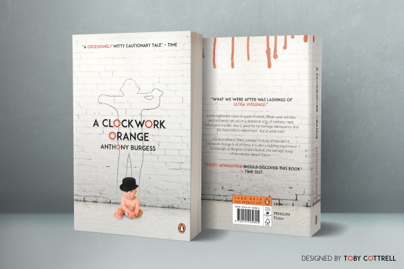
My initial design tries to portray the juxtaposition between the innocence of youth and the violence in the book. Everyone starts of as a blank slate, an innocent child with no idea of how the world works. Having the baby sitting in the middle of the page with the hat and the glass of milk that the main character Alex is famous for having is supposed to remind the reader that this hyper-violent animal used to be an innocent child, just like the rest of us.
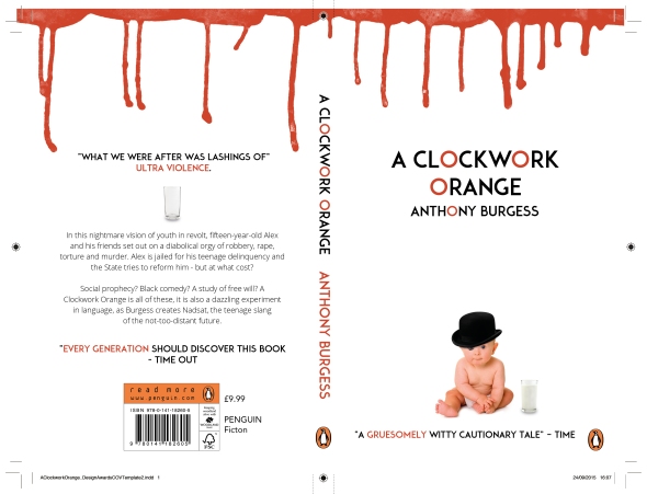
The fonts that I chose are Adam and Roboto. Adam is a very clear but harsh title font, with a lot of sharp edges and bold letter forms. I felt that the way that the O is shaped was perfect for the title and allowed me to create a subtle visually effect that referenced the orange. Roboto is the font that Android use for their main font, just like Apple use Helvetica, and it is a very simple but diverse font that fits well with almost anything. Therefore it is perfect for the body text.
I received a lot of good feedback from peers and tutors, and a lot of people thought that having the blood drip down onto the page was another good way of showing the theme that I was attempting to portray. Although the main criticism that I received was that it wasn’t dark enough.
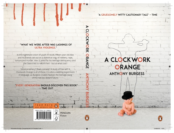
For my final draft I added a brick wall as a backdrop for the entire cover. I thought that it was a good way to keep the minimalistic feel of the cover alive, while also making it a bit darker and grungier. The graffiti outline of one of the gang members is what really made the cover come together in the end. It puts a lot of context into the themes that I am trying to portray, I think that it makes for quite a controversial and powerful cover. I also decided to move the blood drips to the back page as the front page was too crowded and taking them away made the focus on the baby and the outline a lot more prominent.
I thoroughly enjoyed designing the book cover. It is definitely one of the most evolved pieces of work that I have done and it took a lot of trial and error to make it the best that it can be. I will definitely be having a go at designing more book covers in the future.